
#ProductoftheWeek Nilo Ninfea
Spas and Spa Design are one of the fastest growing industries, along with the concept [...]
Feb
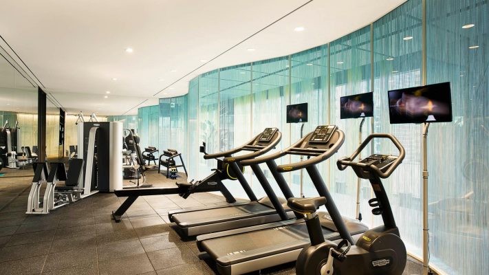
Which Cardio Workouts Burn the Most Calories?
Cardio is a great way to shed the pounds, tone up and boost endurance. The [...]
Jan
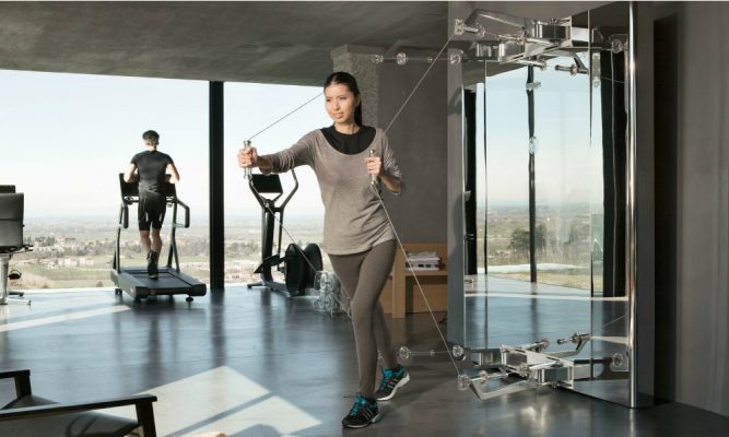
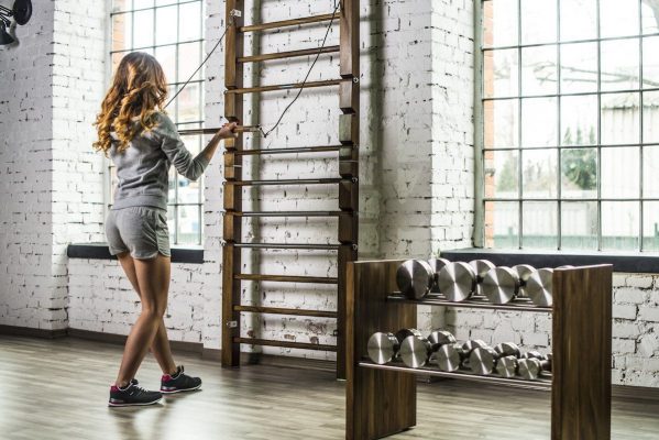
Why Cable Machines are a great addition to your Wellness Space
A question we often ask ourselves is what is more effective when improving muscular definition. [...]
Jan
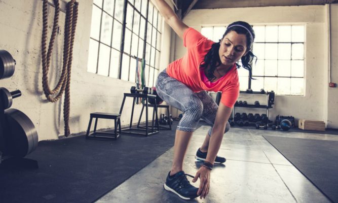
Gym accessories to boost your home HIIT workout
Not many of us know that HIIT (High-intensity Interval Training) is over a century old [...]
Jan
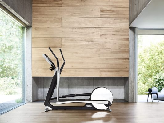
Which Technogym Cross Trainer is best for my gym?
A must have in your home, commercial or yacht gym, the Cross Trainer is a [...]
Jan
#ProductoftheWeek: The Pent Lova Kettlebell Set
Coming a long way from their beginnings as counter-weights in 18th century Russia, the health [...]
Jan

Christmas Gluttony: How To Reduce Your Calorie Surplus.
It’s said that the average Brit consumes a whopping 7000 calories, every year, just on [...]
Dec
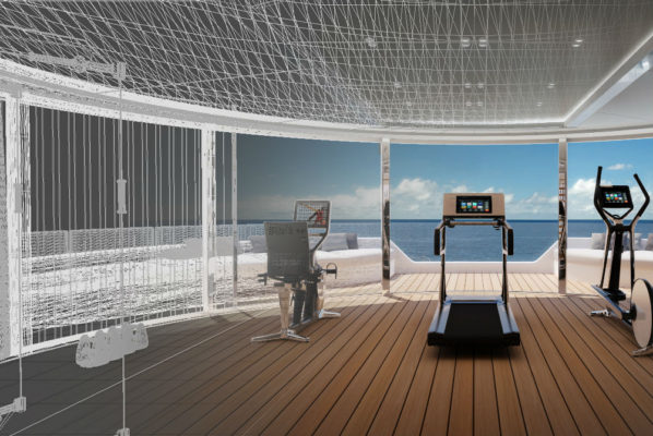
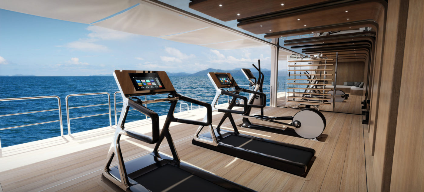
Yacht Gym Equipment – these are our most popular items
Superyacht gym design is all about stripping back the processes of traditional wellness area planning [...]
Dec

The Christmas fitness gift list for the person that has it all
The countdown to Christmas has begun which means mulled wine galore, constant eating and an [...]
Nov
Which Technogym Treadmill is best for my gym?
Given that the treadmill is a staple in almost every gym, you’d expect that competition [...]
Nov